Today marks one year since I boarded an airplane headed from Phoenix to Minneapolis to start a new chapter up here. In this special edition of The Friday Five-ish, here are a few photos from my first year up here.

21 April 2022: The last photo taken on the ground as a Phoenix resident, from a Delta 757 getting ready to scream down Runway 25R at Sky Harbor 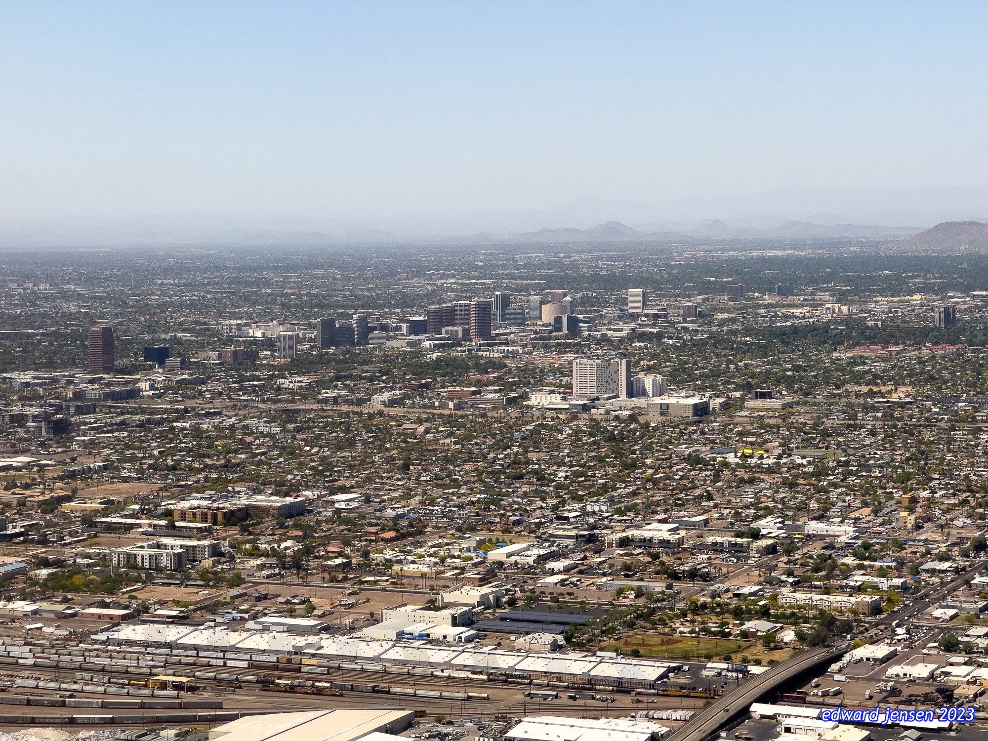
21 April 2022: On climb out from Sky Harbor 
21 April 2022: This photo of the downtown Saint Paul skyline seems even more prophetic 
11 May 2022: Not quite three weeks in, and severe weather’s already on the menu. A line of severe thunderstorms and embedded tornadoes rolled through Minnesota that night 
21 May 2022: After converting it from a storage closet, my office at Meda becomes my own. Photos from Phoenix adorn the walls 
15 June 2022: Minneapolis-henge in downtown Minneapolis 
18 June 2022: And there was arts. The Bach Roots Festival presented the Saint Matthew Passion 
16 July 2022: The International Day of Music in downtown Minneapolis culminated with the Minnesota Orchestra playing outdoors at Peavey Plaza, and whose concert concluded with Mussorgsky’s Great Gate of Kyiv accompanied by pealing bells from six downtown churches 
30 July 2022: City House in Saint Paul – a converted grain elevator is now a lovely outdoor restaurant 
19 August 2022: The St Paul Saints! 
29 August 2022: And the Minnesota Twins from a perch way up on high 
21 October 2022: When I got tickets for this concert, the appointment of Thomas Søndergård to succeed Osmo Vänskä as the Minnesota Orchestra’s music director hadn’t been announced. The first of 3 Minnesota Orchestra concerts I attended this year 
5 November 2022: The Twin Cities chapter of the American Guild of Organists organized a “pipe organ crawl” of five instruments of the late Minnesota organ builder Charles Hendrickson. Here is his III/46 op. 51 (1979 from the Church of Saint Mark in Saint Paul 
14 November 2022: The first of the many many inches of snow. Driving in it wasn’t fun at first, but it became pretty okay 
2 December 2022: My apartment in downtown Minneapolis had this view on most winter mornings 
31 December 2022: It was wonderful to be able to take a trip back to Phoenix over the end-of-the-year holidays. The sun sets on the wild ride that was 2022 
1 January 2023: While back in Phoenix, I got got to see 
20 January 2023: After a few false starts, I finally have a place of my own over in downtown Saint Paul. I have expansive views of Lowertown, the Mississippi River, and St Paul Downtown Airport 
3 February 2023: This is the coldest temperature I saw this winter. Thank goodness for good winter clothing and lots of layers! 
22 February 2023: The week of snow and blizzards. But doesn’t Mears Park look like a scene from a snowglobe? 
3 March 2023: One last look from my patio of my now-former downtown Minneapolis apartment. It was a great place, and I definitely miss my neighbors 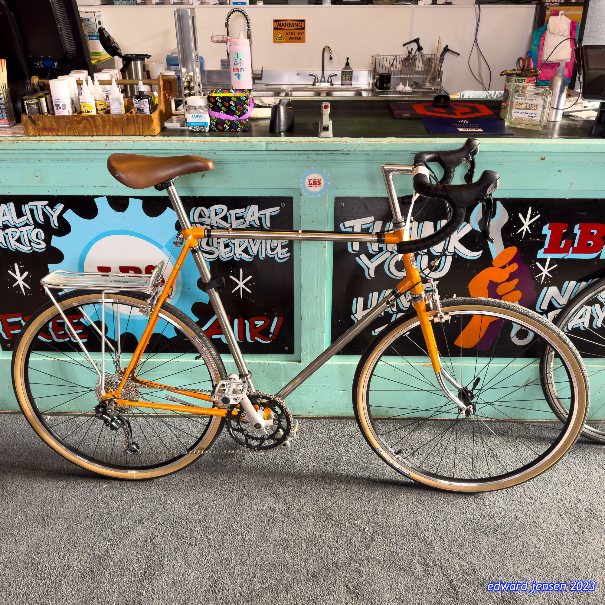
17 March 2023: After a few years in storage, my bike is ready to go again. Lowertown Bike Shop in downtown Saint Paul’s Union Depot upgraded the components on the bike so it’s the newest vintage bicycle in Saint Paul 
1 April 2023: A no-foolin’ April Fools snowstorm dumps 8 inches of snow in downtown Saint Paul 
1 April 2023: And later that night, it’s time for a concert back with the Minnesota Orchestra in downtown Minneapolis 
18 April 2023: Play ball! The first of many Saints games this year, and when you’re four blocks from CHS Field, of course you’re going to go a lot